Our brand pillars describe who we are. They express our beliefs and inspire our behaviors. Our brand pillars are innovative, exciting and inspiring. These pillars help shape the products and the marketing materials that we all create within the new Visual Identity System (VIS).
Brand Guidelines
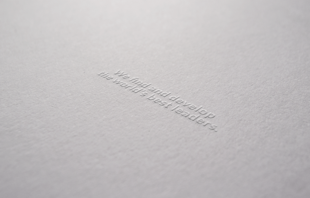
The N2Growth brand elements represent our commitment to find and develop the world’s best leaders. It also symbolizes our vision of building a global marketplace of servant leaders engaging the challenges of our time.
N2Growth Brand
Brand Elements
The N2Growth Visual Identity System currently comprises five core elements that help unify and communicate our brands with consistency and clarity. They include our logos, the We find and develop the world’s best leaders tagline, the N2Growth typography and color palette. Together, they help convey the N2Growth visual brand identity.

Logo
2 Types of Logo
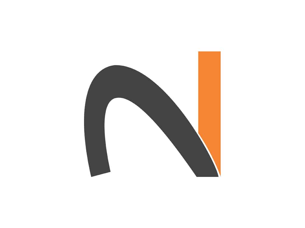
The N2Growth brand logos, the Logo / Symbol Light, and Logo / Symbol Dark. Each comprises two elements: typography, and the N2 symbol. These elements not only simplify and unify our brand, but also help increase recognition of our services.
In addition, the N2 symbol may be used on its own whenever the N2Growth logo will appear multiple times throughout a document.
Logo Dark
Symbol Dark
N2Growth’s brand Logo / Symbol Dark is to be used against a light colored background. I.e.. Logo Dark on white background.
Logo Light
Symbol Light
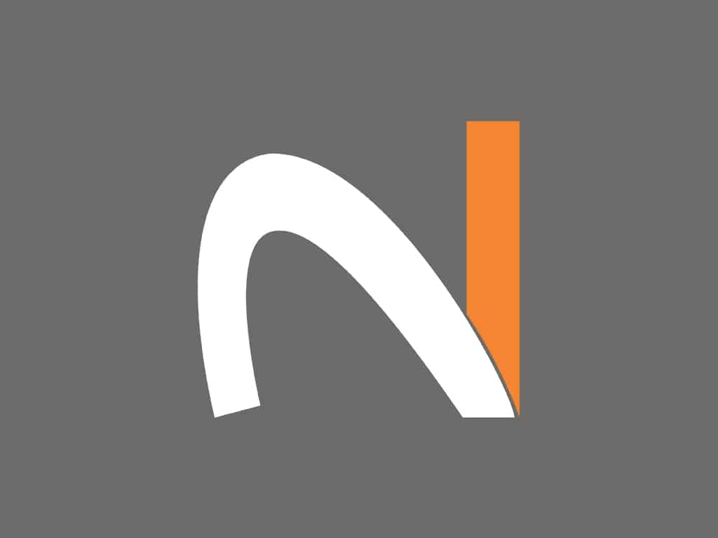
N2Growth’s brand Logo / Symbol Light is to be used against a light colored background. I.e.. Logo Light on dark gray background.
N2Growth’s brand Logo White is to be used ONLY against N2 Orange and Dark Gray colored background. Please reference the color section of this page, to validate correct orange and dark gray.
Clear Space
Minimum clear space around the logo ensures visibility and clarity. The N2Growth Logo should be kept clear of other logos and design elements. To measure clear space, the layout unit of measurement, “o,” is used. “o” is derived from the letter “o” in the word Growth; each”o” unit is equivalent to 1X. The minimum clear space required around the logo is 1X, both horizontally and vertically.
Tagline
Tagline
We find and develop the world’s best leaders.
Use our tagline We find and develop the world’s best leaders with intention and integrity. Follow the guidelines below for correct usage whether applied as a headline, as a statement in body text.
Use our full tagline We find and develop the world’s best leaders. Is to be used when N2Growth is promoted as a company. Or when highlighting multiple services.
Slogans
When discussing a specific area of service, one of the alternate slogans may be used. I.e.. We find the world’s best leaders. may be use to promote our executive search services.
Executive Search
We find the world’s best leaders.
Leadership Development
We develop the world’s best leaders.
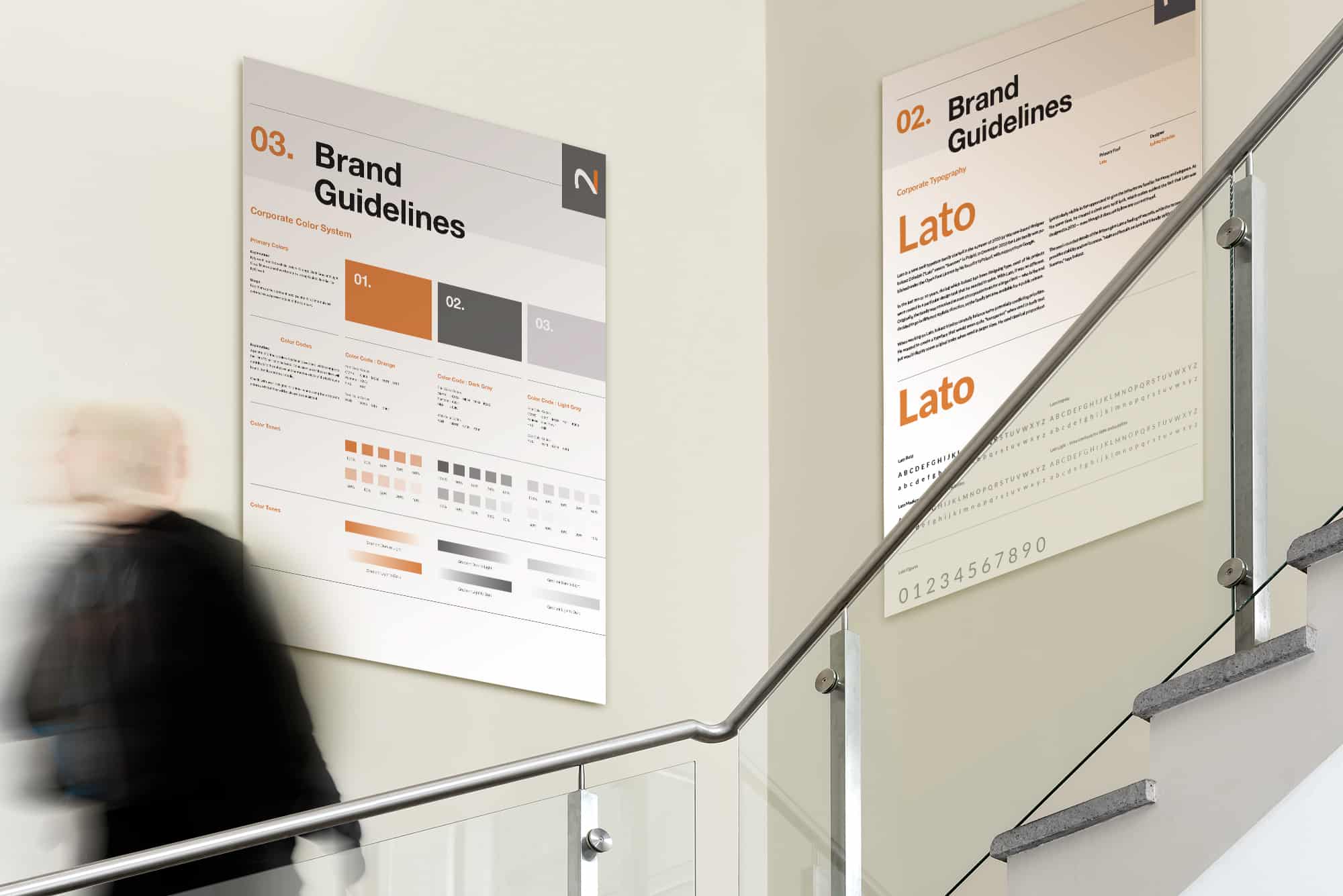
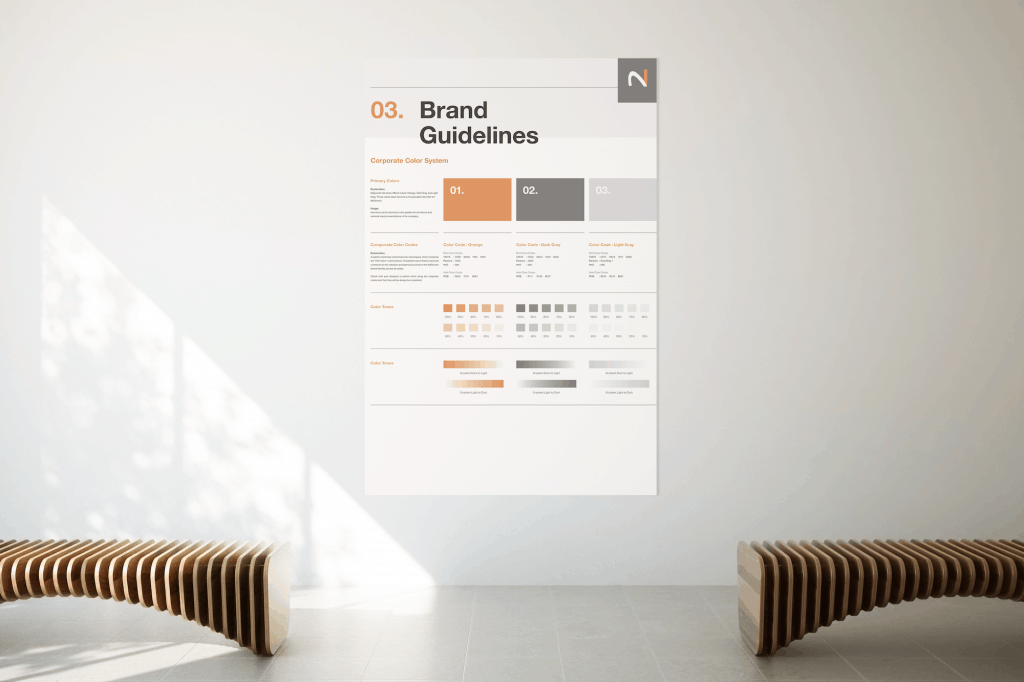
Color
Color is a powerful means of recognition, helping establish a clear identity and distinction for N2Growth and our Services. At the heart of our brand is N2Growth Orange. Orange is the color of enthusiasm. It is highly visible and conveys N2Growth’s spirit of positivity.
Brand Colors
Our color palette is simple and impactful, comprising N2 Orange, white, dark gray, light gray and black. These are the colors of both our identity, as expressed through our logos, and our entire Visual Identity System. In addition to the colors inherent within photography, these are the only colors to be used in our brand communications.
Consistent use of these colors will contribute to the cohesive and harmonious look of the N2Growth brand identity across all media.
N2 Orange
PMS 722 C
CMYK 009 056 081 001
RGB 225 131 061
HEX #F2853D
N2 Orange is the primary brand color expressed throughout the N2Growth brand. In marketing communications, it may also be used in typography and as a background.
White
CMYK 00 00 00 00
RGB 255 255 255
HEX #FFFFF
White space allows for information to breathe and often promotes greater visibility and impact.
Light Gray
PMS Cool Gray 1
CMYK 017 014 011 000
RGB 218 216 221
HEX #DAD7DC
CMYK 017 014 011 000
RGB 218 216 221
HEX #DAD7DC
Light Gray may be used as a secondary accent color when sufficient contrast can be maintained for legibility.
Dark Gray
PMS 402 C
CMYK 053 044 044 K030
RGB 111 109 107
HEX #6E6C6B
Dark Gray may be used as a secondary color in headline and body text when sufficient contrast can be maintained for legibility.
Black
PMS Black C
CMYK 00 00 00 100
RGB 00 00 00
HEX #000000
Black is generally used only for typography, but may be used in other select and appropriate situations.
Website and Microsoft applications use RGB color mode.
Spot printing, screen printing and embroidery use Pantone® color modes.
Video applications use HEX color mode.
Digital printing from Adobe CS programs uses CMYK color mode.
Note: Colors will not match exactly across various media applications. This is due to the differences between the displaying media and type of reproduction. For instance, colors will appear more vibrant in digital than on paper because digital is a backlit surface, as opposed to paper, which is an opaque surface. Even within the same media, applications may appear slightly different. For example, computer screens may be calibrated differently, and paper materials have different hues and levels of opacity.
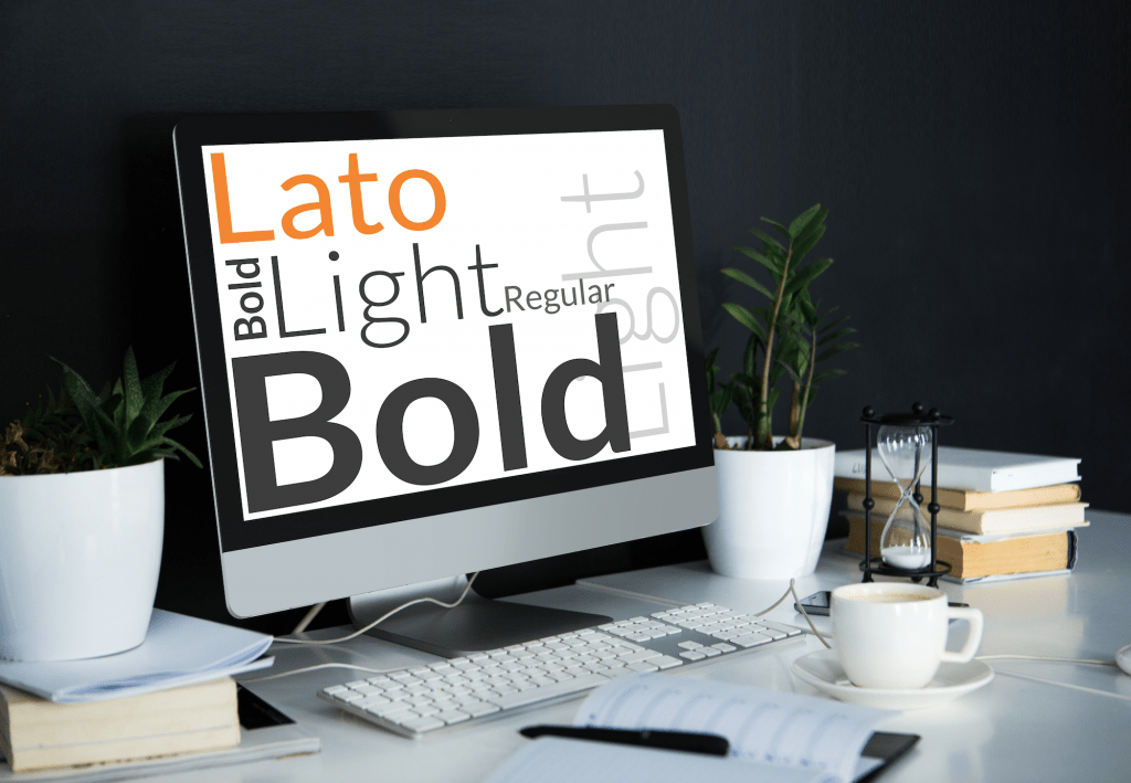
Typography
Typography provides a strong, unifying element and can help convey a consistent brand voice across various marketing communications. Our font is approachable, human and highly technical, and it has been conscientiously engineered.
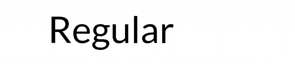
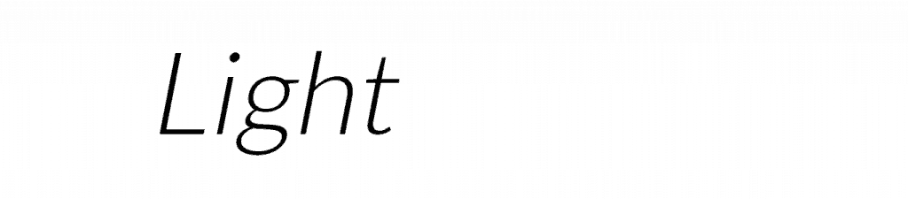
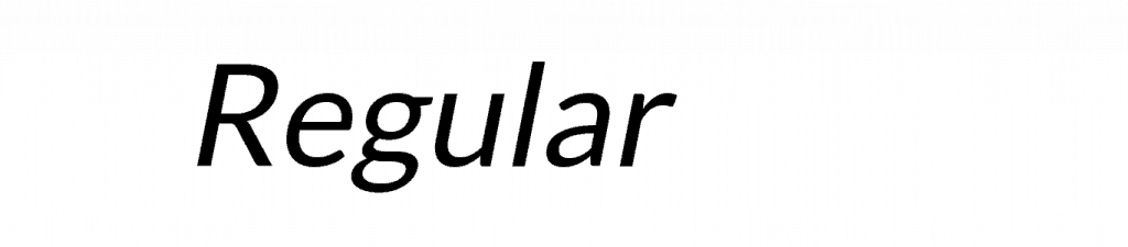
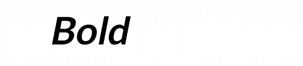
Primary Font Weights
There are three preferred and two optional weights for use within the Lato Font Family. Each weight includes uprights and italics. The selected and acceptable weights are Light, Regular, Medium, Bold and Black. While additional weights are available within the Lato Font family, these are the only five that should be used unless a specific case otherwise demands.
Light
Regular
Bold

Light
Regular
Bold
Secondary Font Weights
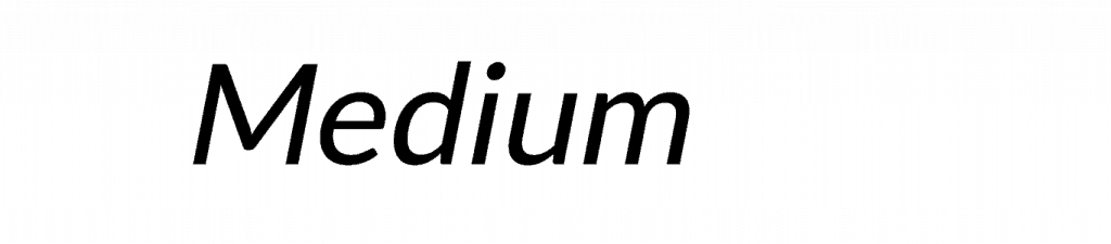
The optional Lato Fonts weights are Medium and Black. These may be used when appropriate. Medium should be used in instances where the communications are focused on enhanced technology, precision or the weight feels appropriate for the intended message (i.e.., single color print ad).
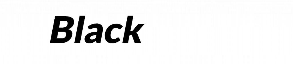
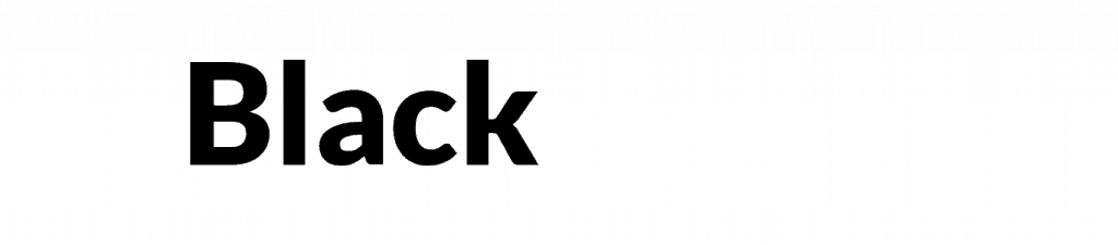
Black should be used in instances where stance and presence need to be reinforced, or the weight feels appropriate for the intended message
Medium

Black
Medium
Black